Whether you plan on using fonts for personal or commercial use, you need to consider a couple of things. Fonts say a lot—sometimes more than the words themselves. Branding, logos, marketing campaigns, and so many other things are given power through the fonts that are used to display text. There are many kinds of fonts, too. Sans serif, serif, script, and so on. That is why you need to know the trending fonts, the ones that continue to inspire graphic designers and creators.
We have put together a list of the top 20 fonts to use for whatever graphic design project comes your way.
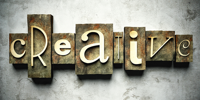
What are the best 20 fonts for logos, branding and Graphic Designs?
Top 10 Display Fonts
1. Cormorant
Inspired by the 16th century fonts by Claude Garamont, Cormorant is unique and eye-catching. Most of all, it strikes the perfect balance between elegance and expression.
2. Emberly
A combination of classic and modern elements, Emberly looks at home amid magazines, images, and websites. The font was inspired by Didone and has quite a bit of versatility. Use it with projects that will go into print.
3. Playfair Display
This font was inspired by a typeface from the 18th century known as Enlightenment and Baskerville fonts. The letters are delicate and are reminiscent of the lines made by pointed steel pens. Businesses that want a touch of daring will love Playfair Display.
4. Aleo
If personality is important to you, take a look at Aleo. The font is highly readable from near or far, and the character is undeniable. Aleo features semi-rounded elements mixed with a sleek look that balances it out. It’s a bold statement font that is great for calling attention to bigger chunks of text.
5. Arial
Useful as both paragraph and display text, Arial is considered de facto by most. It is one of the most widely utilized sans serif fonts in the world. Although Arial lacks a lot of charm seen with other display fonts, it has a clean, professional quality that works.
6. Impact Regular
Here is one way to turn heads: Impact font. This is one bold choice for a headline, especially shorter words. Whatever you do, do not use Impact for longer statements and sentences. Pair it with a slimmer font, like Tahoma or Times.
7. Bauhaus 93
There is no other way to describe Bauhaus fonts than “artsy.” Bauhaus 93 is a high quality font that fits perfectly on logos and banners. The font also loves gradients and color; it meshes well with imagery, too. Graphic designers who are not afraid of experimentation will love the vibe of this font. Use it for short displays and logos.
8. Book Antiqua
Although Book Antiqua is not the same font as the one used for Game of Thrones, the look is so similar, you might be deceived at first. The font is also along the lines of Times New Roman, but the quality is much sharper and visually interesting. Moreover, it looks simply epic in all capitals with a bit of beveling and embossing. Book Antiqua is an excellent choice for ebook covers and fanfiction.
9. Source Sans
Yes, Source Sans is a huge collection of fonts with sans serif and serif included, and it can be hard to tell them apart. The main reason it is ideal as a display font is because you can mix both extremely bold and thin letters together to create an intriguing piece.
10. Tahoma
Here is one sans serif font that is an attractive alternative to Arial. The letting is nice and bold, and it is very legible at larger sizes.
Top 10 Script Fonts
1. Restora
Restora must be downloaded from the internet (for free), but it is one download you won’t regret. The letters are classical—but with a scintillating twist. The font is an embellishment that is highly versatile. Use it for books, editorials, and logos.
2. Grenze
Inspired by both Blackletter and Roman fonts, Grenze has an abstract vibe that is perfect for announcing promotions, events, and signage. The font was originally created for magazines, but it has a load of flexibility.
3. Garamond
Did you know that Garamond is a script that dates back to 16th century Paris? It’s true! Garamond is great for elegant lines. The font is also very popular with graphic designers because the lines are neat and the overall appearance is aesthetically pleasing. If you use Garamond, the vibe is going to be one of quality, value, and hospitality.
4. Harrington
Here is a playful font that is ideal for whimsical titles and businesses. When looking at the Harrington font, you might think of yoga studios, hippie cafes, and fantasy. The spacing between the letters, as well as the curves and loops, are all very playful yet elegant.
5. Bookman Old Style
Bookman Old Style makes for striking headlines when using block capitals, while the regular font is excellent for longer sentences. Although the style is less modern, the font is incredibly versatile and pairs well with a number of applications.
All Bookman fonts have a trustworthy vibe, so it is a good choice for professionals that need to establish a reputation, such as lawyers and contractors.
6. Juice ITC
The moment you see Juice ITC, you might think of a Tim Burton film. It looks like it came straight from a cartoon world and has a Halloween-y feel about it. Juice ITC is suitable for more quirky advertisements and businesses and promotional events.
7. Georgia
One of the true web fonts out there, Georgia is similar to Verdana in stature, making it larger and easier to read than other fonts of the same font size. It is a great serif font for statements, but you should avoid pairing it with similar serif fonts (like Times New Roman), because it will make such fonts look smaller than they really are.
8. Alegreya
Not only is Alegreya decent in paragraph-form, it has a dynamic look that makes for bold headlines and statements as well. In fact, Alegreya was designed to make reading online more easy on the eyes.
9. Slabo
Yes, this one blocky font; that’s why it is ideal for saying, “hey, read this.” Slabo was designed with mobile platforms in mind, and the fonts are tuned more towards digital media than print. That said, despite being a serif font, it has a lot of personality.
10. Merriweather
Another font designed for easier reading on screens, Merriweather is constantly being improved by the GitHub community. The font has a high x-height and more condensed letters, yet it looks radiant as either a subtitle or even in longer forms of text. Try it out.
Final Thoughts
Hopefully, you have found some amazing fonts in this list or have gotten inspired. There are millions of font styles out there, so don’t stop looking until you have found the one that makes you say, “This is the one.” Whether the style is flexible, simple, or elegant, you can find one that is readable and effective. If you are unsure of what kind of font to search for, why not ask a graphic designer? Designers know how fonts affect branding and can give you plenty of advice.
